Project Update: An Alcove Studio Gets a Vision
Mission: Cohesion
Working with friends is fun, so when I got the chance to work with Belinda to bring a new vision to her NYC apartment, I was so excited to get to know her better in context of her space.
She’d just moved back to the city after some months away for work and was looking for a total refresh on her space. After our first meeting together, a few things stood out to me in terms of what she was after:
Cohesive Vibe Top to Tail — The biggest thing was to bring a cohesive vision and vibe to her space. Making it feel creative and reflective of her personality, but perhaps more important, curated like a real adult’s apartment. She was so over the collection of furniture she’d bought or been given to fill space. It was time for her apartment to meet her outside her twenties!
Space for Friends — Belinda entertains a lot — loves to have her friends over for dinner at her home. Keeping her big dining table was a must, but we also needed to utilize the full space in her apartment to make sure people didn’t get clogged up by the front door (where the kitchen is) and actually utilized the full space.
Space for Belinda — But, I also wanted to be mindful that the person using this space day in and day out was not a pack of people gathered around a dining table. Belinda lives and works in her home, so we needed to make zones of space to make sure her needs were covered, the flow was right, and everything had its proper home
When in doubt, make a moodboard
Coming out of my first session with Belinda, I felt clear on what I needed to create functionally for her, but the stylistic vibe she was after was less clear. Which is super fun. So, I set to work creating three separate concepts for her to react to and get a sense of what she was gravitating towards before I set to work choosing finishes.
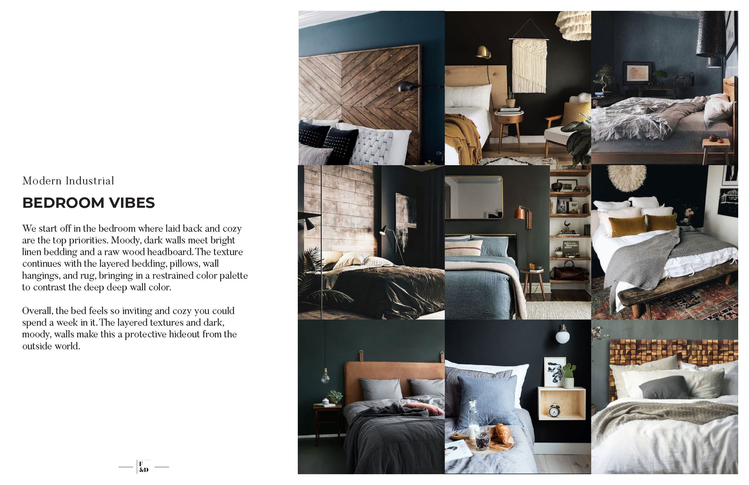
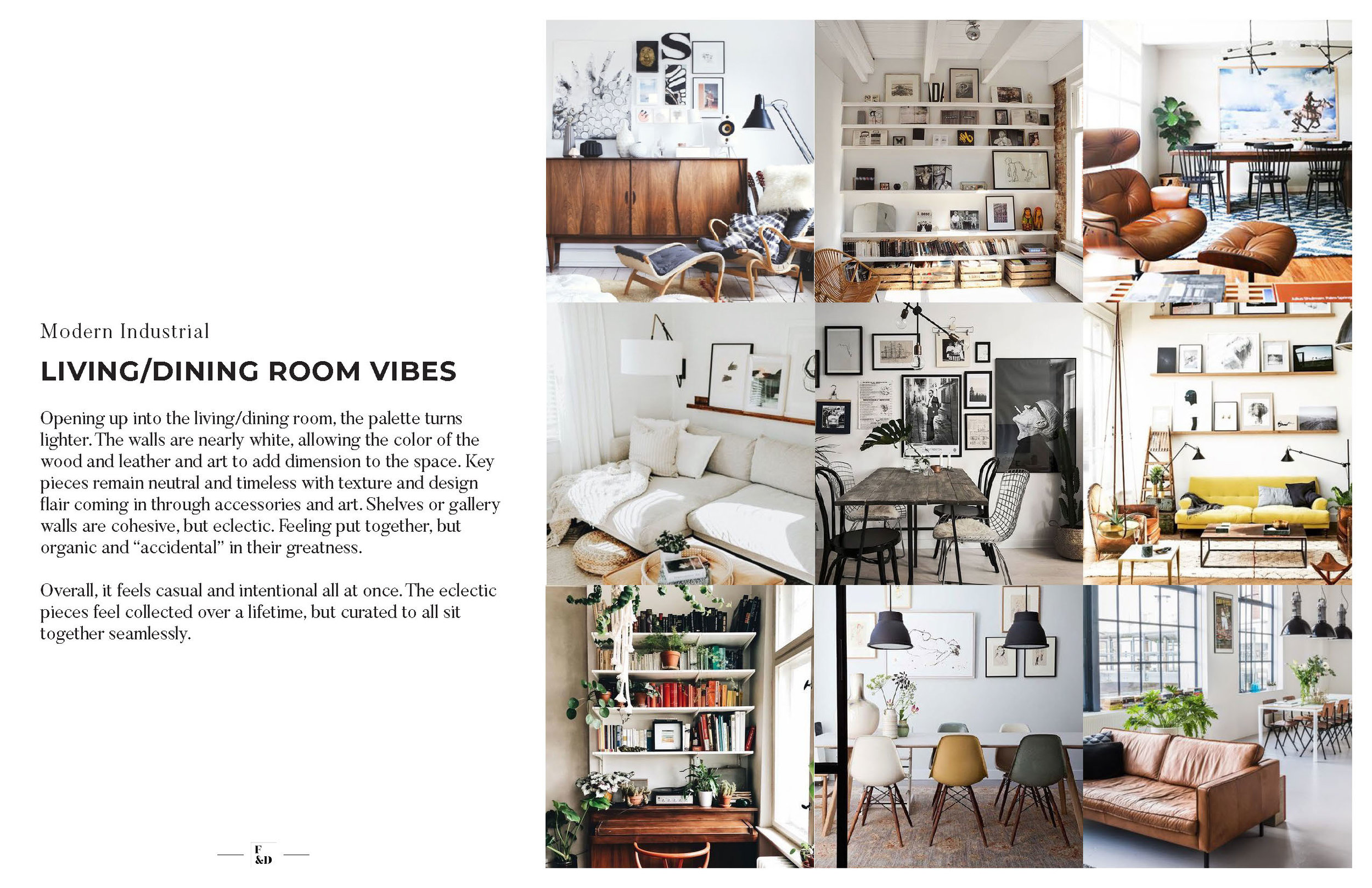
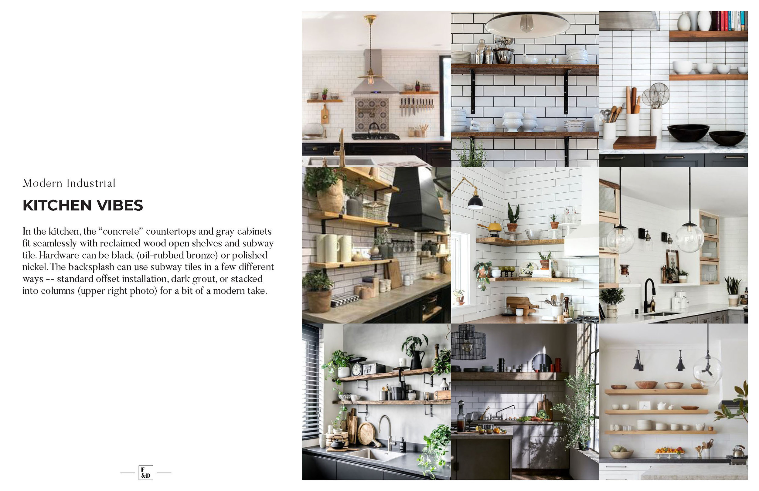
Concept 1: Modern Industrial
A sleeker, more modern version of an industrial vibe. Everything is a bit more refined (partly because we don’t have loft architecture like exposed brick or mega-high ceilings), but still captures that beautiful, dinged-up, intention.
Imagine a renovated loft downtown or a cool old house outside the city.
It feels casual yet refined. Moody, but open. Curated, but by happenstance. Everything is easy and laid back.
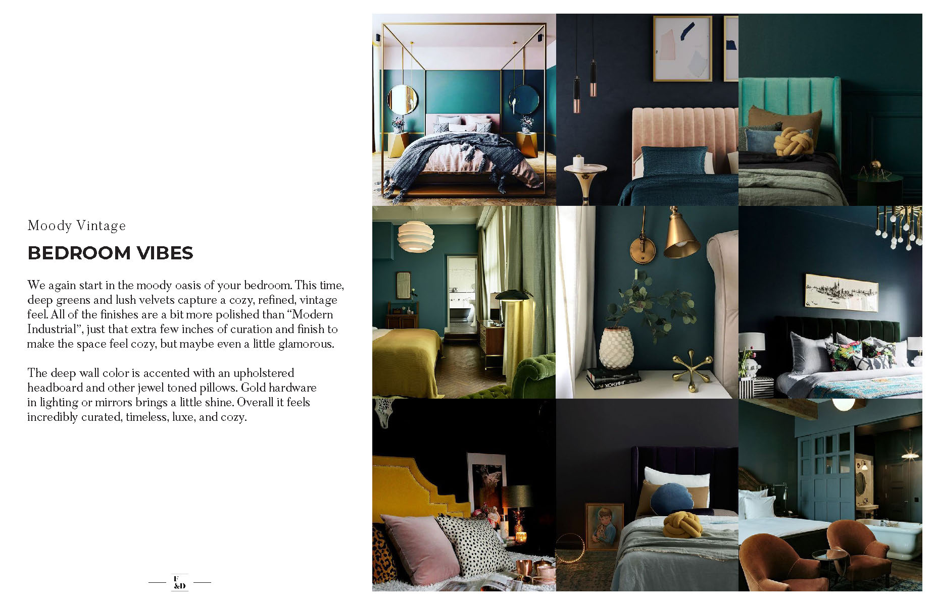
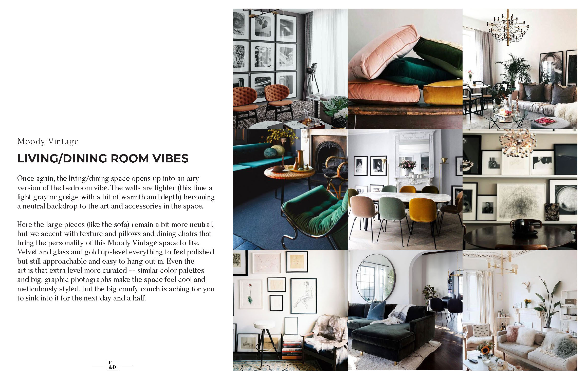
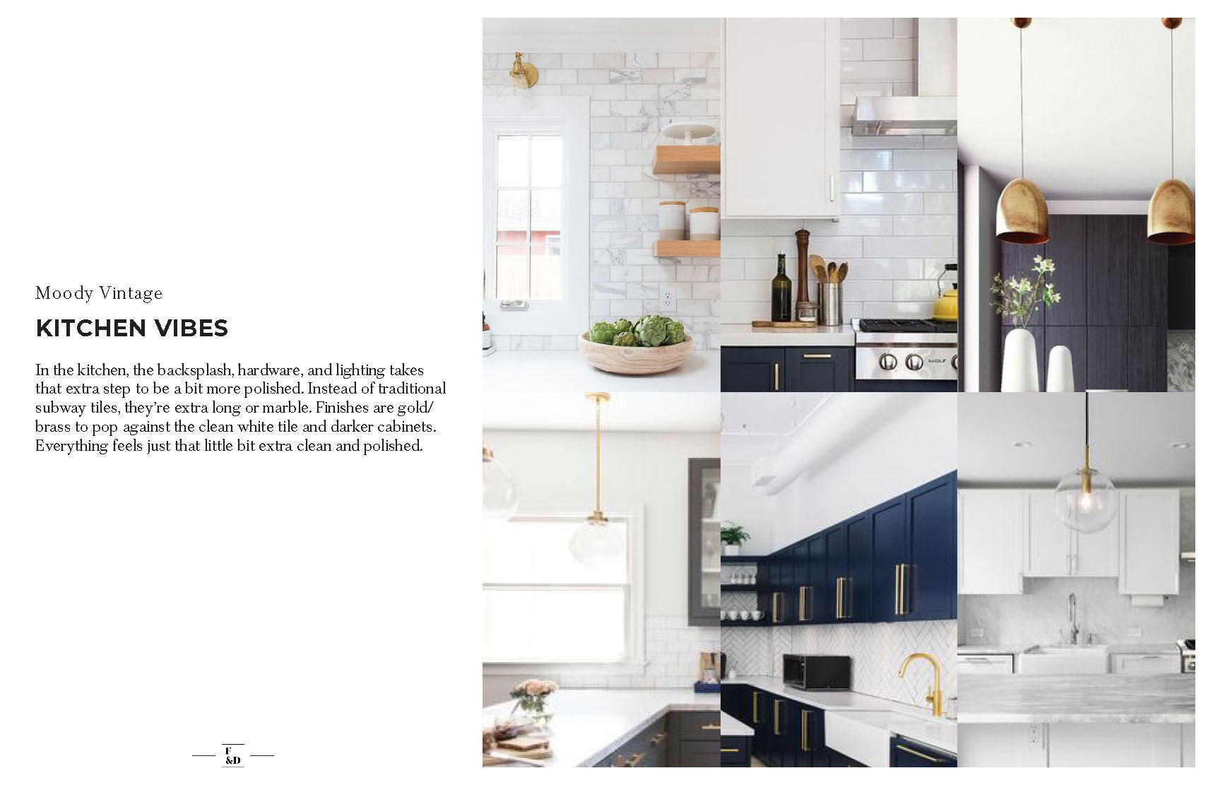
Concept 2: Moody Vintage
More polished than Modern Industrial, Moody Vintage leans into art deco and mid-century simplicity and layers in a ton of texture and refinement.
Imagine the most beautiful SoHo House in Europe, newly finished in a building that’s stood for 200 years.
It feels grown-up and incredibly intentional, but never stuffy. Everything is meticulously chosen and has a purpose (even if only its purpose is being beautiful)
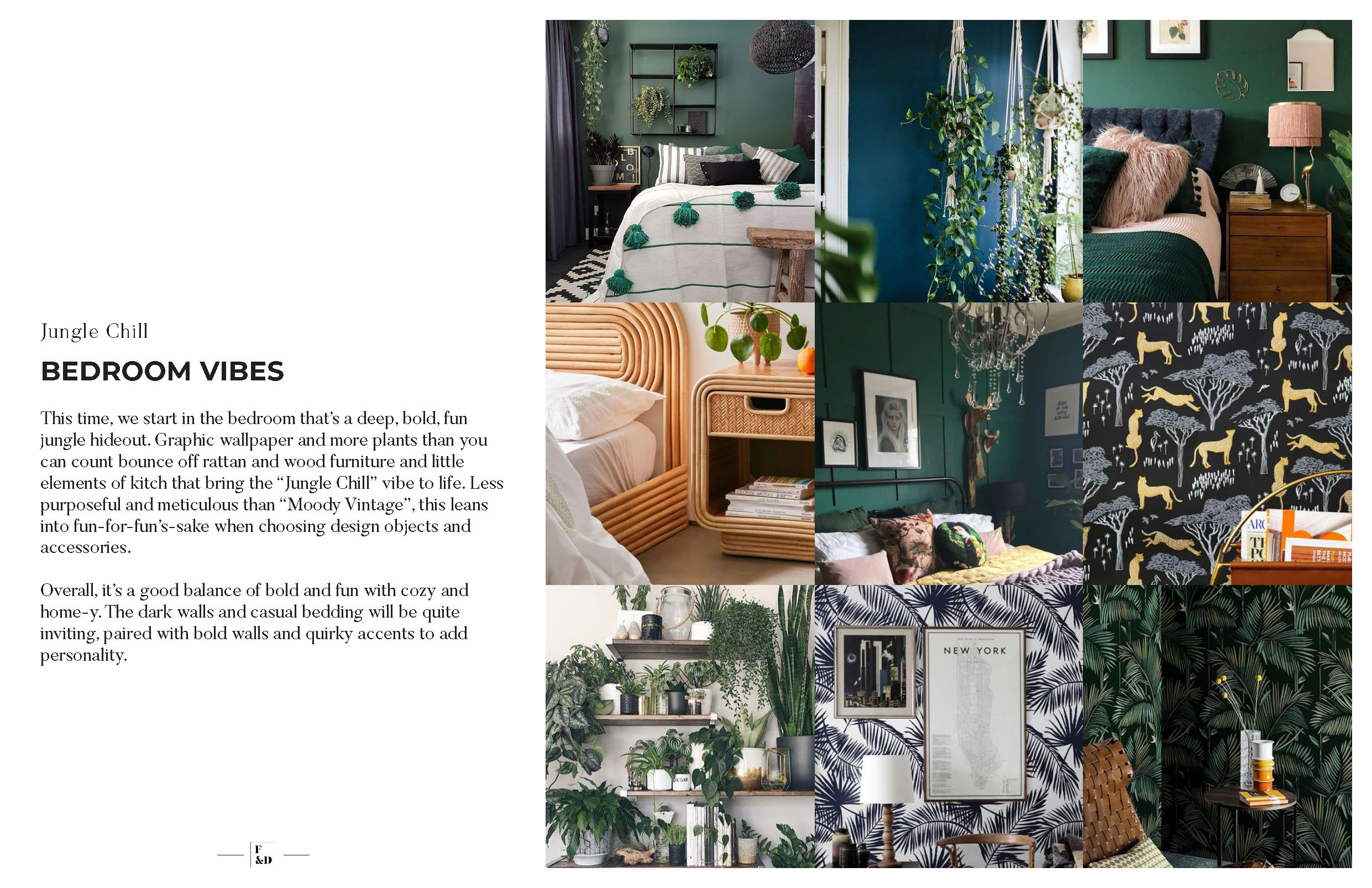
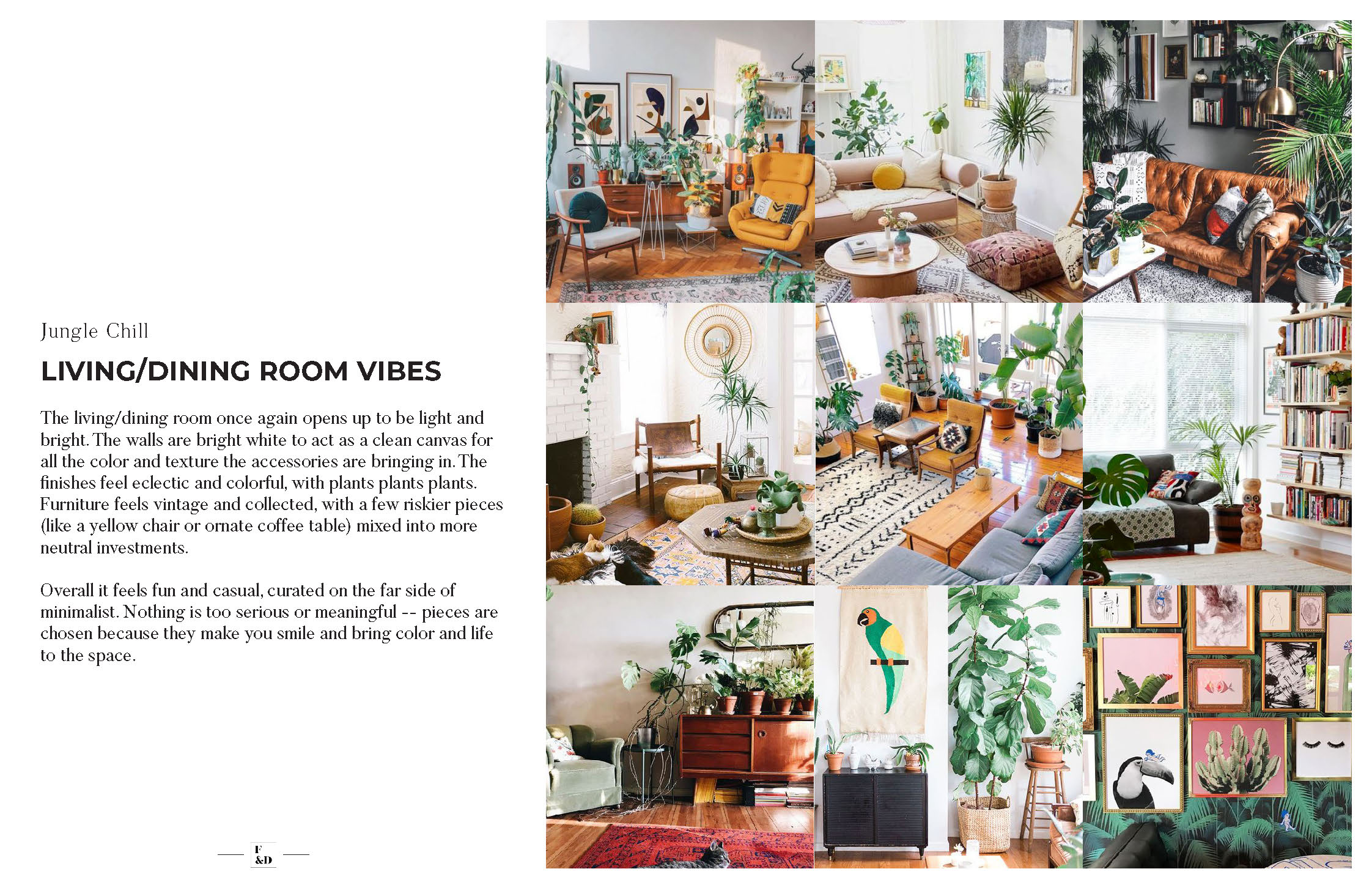
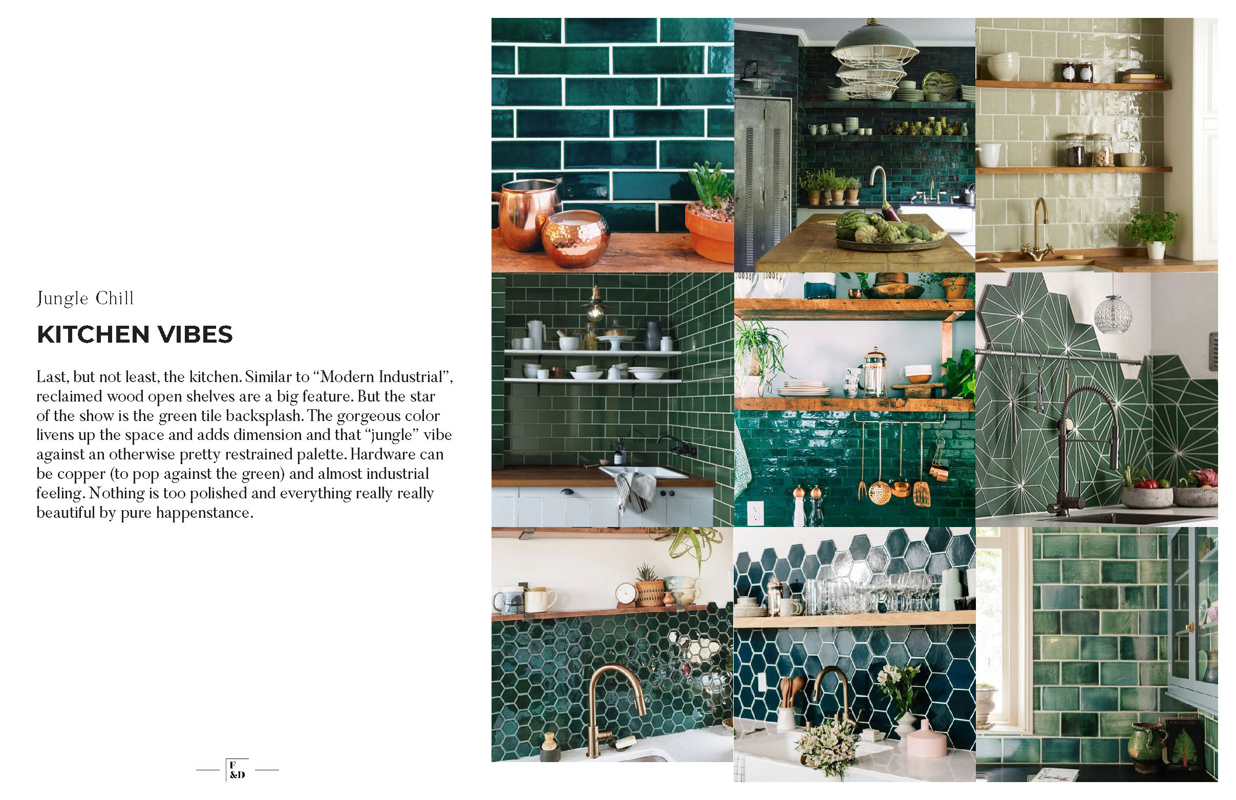
Concept 3: Jungle Chill
The most “out-there” of the three options, Jungle Chill goes hard into the greens and leaf-motifs to create a cool, fun, quirky space.
Imagine the coolest hotel lobby in Miami you’ve ever visited.
It feels cool and fun, with bold design leading the way. A bit more ephemeral and decorative than the other two concepts. Everything has visual impact, even when understated.
Progress Coming Soon!
We’ve been hard at work sourcing finishes and installing the bits we have as they’re delivered, so stay tuned for the final product!
x
